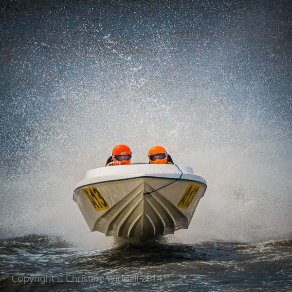
Square Format
I’ve heard people decry the use of the square format – in fact one of my very long standing friends in the world of photography positively hates anything SQUARE and in particular anything with the subject in the centre or with symmetry. She and I are pretty much clones of each other except in this one detail…I quite like the square format. The square format was pretty common when I first learned photography back in…well, never mind when. Medium format cameras often took 6×6 cm negatives (we called ’em two and a quarter square back then). Some of the more “arty” members of the Exhibition circuit currently compose exclusively in square and the simple fact is that some pictures look better in the square.
In Blue Peter fashion, here are some I made earlier:


This afternoon, because I am confined to home with a heavy cold and laryngitis, I set about making a couple of new images as a means of relaxation and to take my mind off things.
Creating a balance in square format images is a little different to the 3:2 format that we work with in many DSLRs. The main challenge here is to create pictures with balance. Forget about the rule of thirds (if you ever think of it anyhow) and even consider whether the picture will work with the main subject right in the middle, which it often can.
The square is a very “stable” format, tending to guide the eye around the frame in a circular way. Perhaps it’s easier to “fill the frame” with a few simple elements and leaves less unwanted space around the subject. Sometimes the arrangement of elements in the viewfinder lend themselves naturally to square and we can compose accordingly with a view to cropping afterwards. In my case I decided to make square composites.
So, here are the fruits of today’s labour…like them or not. Now I need to lie down 🙁
The Red Balloon:

Incantation:

